Designing our New Logo
Designing for a brand new company can be tough without understanding the types of services they provide and the types of clients they want to attract.
We had hoped that the launch of our new company in fall 2020 would come with a stunning new logo attached. Instead, it took collaborating with the co-founders and figuring out our collective identity to confidently design the Envision Inclusion team a logo that aptly showcases our value within the tech industry.
Check out our journey to a new logo below:
Word list Activity
In the early days of Envision Inclusion, before any clients, we kicked off our ideation phase by bringing in Rachel Schmitz, a design expert and longtime friend, who led us through an identity brainstorming exercise.
This activity involved listing all the words that came to mind that embodied who we are and what we wanted to build. After listing all of these attributes, we color-coded them to group and identify themes.
Word list activity to kick off our ideation phase.
Competitor Analysis
While the word list activity was under way, I dove into researching the competition to uncover how DEI (diversity, equity, and inclusion) companies approach branding.
We synthesized this research after gathering the team’s ideas and inspiration from other companies. This helped us decide on a color palette, design our website, and launch our marketing content.
However, we were still early in our development and signing our very first contracts. We were unsure of what our value add to the tech industry was, or what we even wanted it to be for that matter. Without this crucial information, it became incredibly difficult to design a logo which accurately conveyed to clients who we are as a company.
Evaluating our Current Logo
In order to launch, we needed a website which meant we needed something to use for a logo. Some pros of v1:
A good option put together in Canva quickly. It required little time and research to design. We used Canva to generate a simple logo that didn’t push boundaries.
Blends in well with our content. The minimal use of color in this logo meshes decently with our color palette. It clearly states our full company name, which is crucial for an early stage company that is not well known.
Clearly visible and legible when enlarged. Although harder to read it if it is shrunk down on mobile devices or a résumé for example.
Gets the point across. ‘Inclusion’ (which is what we are all about) is highlighted in the logo.
Goals for Logo Iteration V2
As time went on, I watched as the co-founders started to specialize and find their niche. It became clear that their area of expertise (and what made them happiest) was working with early-stage startups to diversify their recruitment pipelines and build inclusive team and hiring practices from day 1.
With that in mind, our current logo began to bother me. I made a list of goals detailing how our logo could better represent us.
What logo V2 should be able to do:
Gives the perception of expertise in tech recruiting for startups.
Signals a deep understanding of how tech companies operate and can be restructured.
Can scale down to be legible on LinkedIn, résumé, Google search, and mobile.
Doesn't necessarily explain exactly what we do, yet helps clients identify the space EI is a part of (early stage tech startups) and is simple, unique, and memorable.
Prevents us from being seen as a charitable organization or a DEI nonprofit.
DEI Logo Research
Now it was time to dive into logo research. Quick tip: if a company ever asks you to design a logo, try searching for “your company name” and “logo” for fast inspiration. After browsing these results, it was clear that there was a pattern warranting further investigation.
Avoiding Imagery Related to Nonprofits
I researched illustrations and logos returned by searching “Envision Inclusion Logo” and similar key terms used by the co-founders to describe EI.
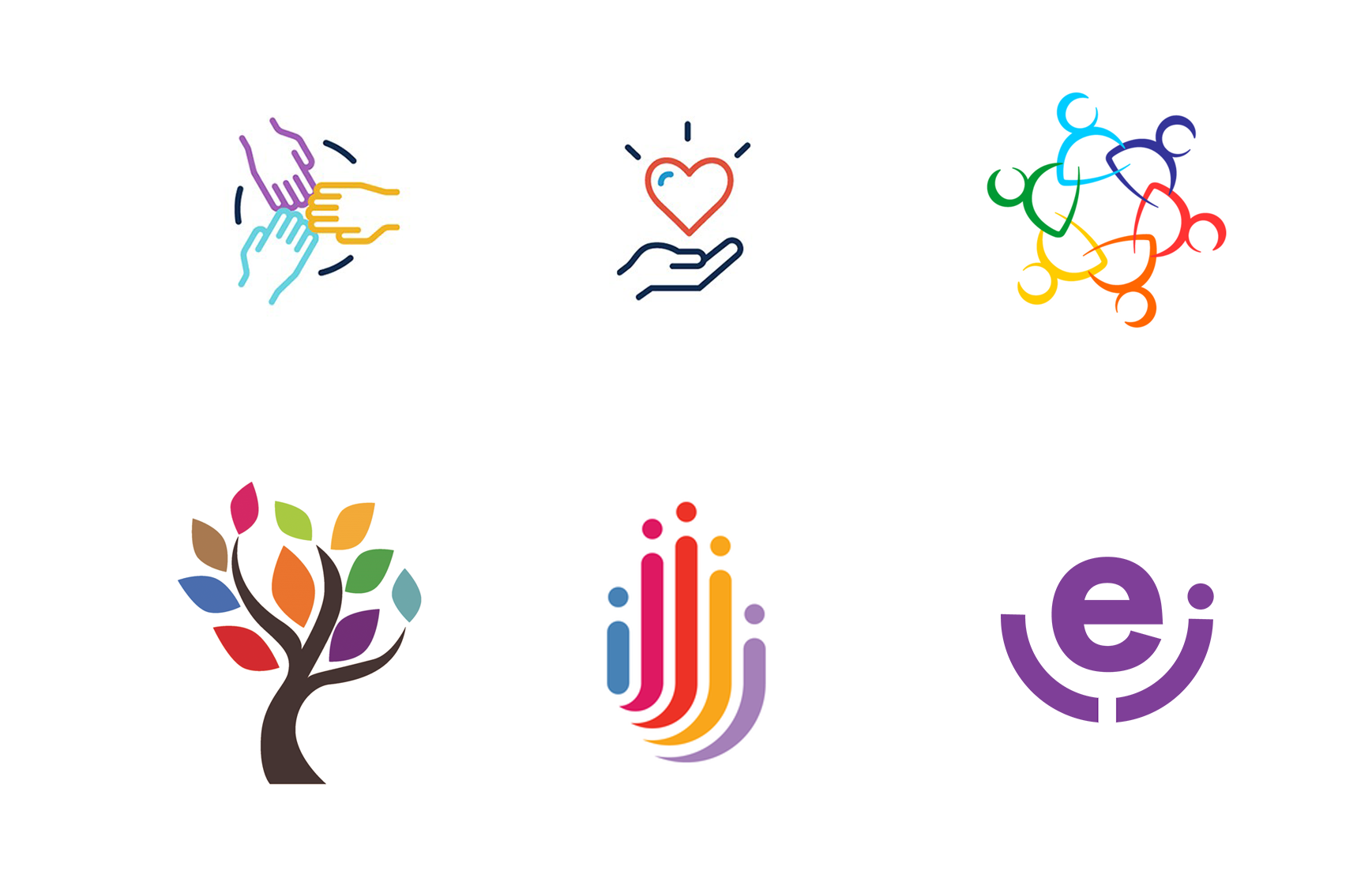
Typical logos I came across to describe “diversity”
I found myself scrolling through a never ending supply of eyeball logos, multi-racial stick figures holding hands, and plant people forming letters with their arms.
DEI companies are clearly associated with this type of imagery. Ideally, we can avoid being clumped together with nonprofit organizations. We want tech companies to know that we are deeply immersed in their industry to ensure they won’t be surprised by the price we charge.
Avoiding Nonprofit Logos
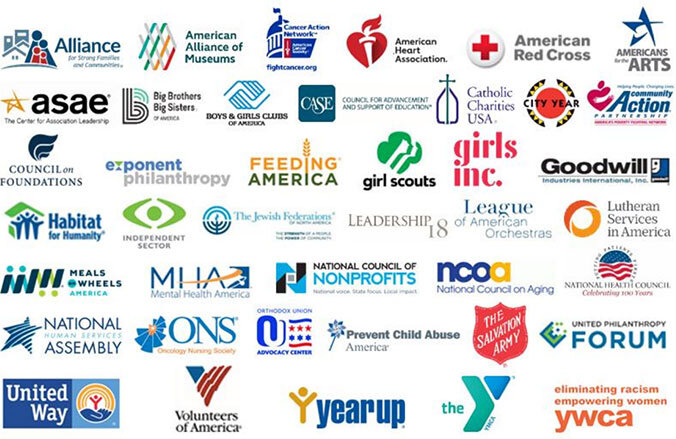
Our name is longer than the names of most tech companies. Many nonprofits have these types of long names.
We are more likely to be mistaken for a nonprofit especially because we are a DEI company (a double whammy).
In most cases, companies involved in the tech space have more simplified logos and shorter names.
An Extreme Example
An extreme example of the type of logo we want to avoid is pictured here taken from the show “Insecure.” The main character of the show, Issa, works at a nonprofit called “We Got Y'all.”
Rough Sketches
Early rough sketches of the various directions our logo could have gone.
Some ideas we explored included eyeballs that represent “envisioning,” plants and DNA strands symbolizing early stage startups, curly braces, and HTML tags.
Sketchbook ideas for v2 logo.
Plant Logo Exploration
Illustrations of a logo incorporating imagery of small plants and seeds.
This was an early logo suggestion - planting small seeds of diversity at early-stage companies and guiding them as they grow. Unfortunately, this would give off strong landscaping company vibes, or even worse, companies would assume we are an Olive Garden competitor.
This all led us to our new logo:
Logo Comparison
I created a slide deck and presented the logo alongside logos of our clients and competitors.
I shared my research and insights. For example, pointing out that the “Racial Equity Institute” has a longer name and is clearly a nonprofit company. And, the logo for Project Include looks a bit like a circle of arms embracing. Project Include is also a nonprofit company. I wanted to convey that the new Envision logo stands out as a bit more modern and related to the tech space.
Comparison to DEI logos
Comparison to Tech Logos
Previewing the Logo Before Deployment
This was included in the presentation to showcase how the new logo would look once implemented.


